The reason i haven't been blogging in a little while is cos i'm currently posting on the Tantrum blog.
Check it out, there really is some wonderful stuff going on over there!

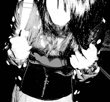
i need this jacket in my life!
too bad i don't have £1,118.80 lying around somewhere in my room!
:(
studded vintage leather biker jacet by Bess
you totes just made my day!
This is the Australian illustrator's first shot at the fashion biz, collaborating with designer Karla Spetic and the girls have done good, no... wait. 


I, for one, am deffo looking forward to some more Shearer/Spetic collabs in the future.
I can only imagine that they'll be even more magic than this one!
check out Caitlin's work here
check out Karla's work here
Well, they were dreamed up in the mind of Conrad Roset, an aaaa-mazing illustrator from Barcelona. As well as working with Zara, he's notched up other impressive names on his client list, including Adidas, Buble, Filmax and Globalrhythm.


I am so in love with his colorful, feminine illustrations, i wish i could live in his dreamy little world.
see more of Conrad's work here

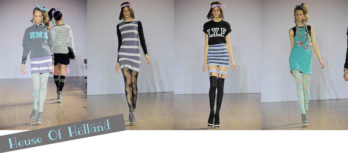
Henry Holland returned to the roots of his burgeoning fashion empire for Fall 2010, re-inventing the slogan tees that made him king of cool oh so many seasons ago.
This time, he’s not name-dropping celebrities with quirky little rhymes, but ensuring no olddd peeps buy his designs by using acronyms that nobody over the age 27 is likely to understand.
The typically light-hearted show was aptly named “CTFO it’s only a show”, which, for those over 27, means “Chill the fuck out”.
Ooh, taking a little jab at the fashion industry there, are we Henry?
Anyway, the collection, inspired by ‘downtown NY’ is sporty, sparkly and graphic, with a little hint of nerdiness thrown in. The acronym lettering seemed reminiscent of varsity jackets, very fitting with the whole sporty New-Yorky thing. Also featured was the ‘bandana print’ repeated throughout the collection on dresses, jackets, trousers...everything. Even hair scrunchies. Oh, and there was a really cute bandage-style dress made from printed House of Holland elastic and some knee-high socks with gold chain prints, adding a touch of luxe to the otherwise casual collection.
There was, of course, also the trademark House of Holland printed tights in pastely purple and blue and lots of bold, graphic stripes, a la Fall 2009, only done a lot, lot better.
Honestly, I was not a fan of last years fall offering from House of Holland, but this year, it’s a totally different story.
I loved this collection. Well, maybeee it went little bit overboard with some of the pieces that were, like, fully bandana-print, they just made my eyes go all funny, but that’s just personal opinion i guess.
All in all, the collection did just what I expected from Henry Holland, it brought the fun back into fashion, which is just what we needed.
House of Holland Fall 2010, FTW.
You beautiful and painfully hip bracelet. You are amazing.


 Nylon
Nylon

 Dazed & Confused

 V
V
I'm gonna begin by saying that usually, i'm an Anastase super-fan. Yep, means that this collection left me a little, well, unconvinced.The Parisian designer cited his influence for A/W 2010/11 as 'Winter Garden' and it features an array of contrasting colours and fabrics mixed together in the typical Anastase playground style. however his latest collection didn't quite live up to my expectations. It's intriguing and imaginative but whilst some pieces are wearable, others just make me go "Oh, Charles! Really? Reeeeeeally? Why?"
The collection features some huge, blanket-style coats, which completely envelop the wearer, they look guaranteed to keep you warm, even in the harsh British weather we've been dealing with recently, which is une grande bonus, there's also an abundance of high-waisted flared trousers, providing an elongated silhouette, which is also added to by the long, clingy dresses. There's a lot of layering (a little too much layering, one may say...) and the majority of the clothing seems to be baggy and shapeless.
The collection overall is still the whimsical, storybook style that Anastase does so well, but it's just not my cup of tea.
What does everyone else think?
 Bright blue clingy dress with contrasting red felted wool coat. I actually really like the coat. And the shoes. What's with the neck/headgear though, seriously?
 The chiffon cape features cute little red envelope shapes, i think they might be little pockets. How sweet!?
 Uh-oh... Little Bow Peep has lost her sheep and dresses up like one in order to find them...
 Too.Much.Layering. I don't know where to look, there's just so much going on!
 Another look reminiscent of farmyard animals?
 The print alone is bad enough. The print on the jacket AND trousers? Horrendous.
 I don't even know where to start with this one. Too many ruffles and the jacket is giving it a bad silhouette. Like, a really bad silhouette.
 The poor girl just looks like she's drowning in this. Never a good look! :(
Sorrysorrysorry to whoever actually reads this, which is more than likely nobody, but i'm trying to be hopeful okay?
I'll leave you with this gaw-jus picture of a scrumptiously fashionable ice-cream by Liz Van Hoene.
Oh I wish Chanel ice-cream cones really existed.
xox

Kinda reminds me of the Spellman house from Sabrina The Teenage Witch, though that wasn't nearly this big!
I'd lovelovelove to live in a place like this! I'd keep it all old and traditional on the outside but totally hip & quirky inside.